Although we were able to scout out all the locations, we still need to do some altercations and changes to it in order for it to fit into the storyline. As mentioned in the Research Film Opening Topic, the main place set for our film opening would be the main character, May’s, bedroom and house which happen to reflect her poor financial status. Hence, having known that fact already, here are some of the changes we will make to the locations that would be May’s house.
For May’s room, we decided that:
– Change the clean white bedsheets into that consisting of childish patterns to reflect her not having enough money to buy a new one as well as to remind the audience that May is still deep down a child inside.
– Include a small foldable table for her studies (add old worn out notebooks, papers, pens, table lamp)
For the dining room, we decided that:
– Make neat tables more disorganized by removing a few chairs on the fit the amount of family members in May’s household.
– Add empty alcohol bottles in a disorderly arrangement (e.g all over the floor, table, counter, etc) to reflect on the dad’s habits and to set a certain environment that allows the audience to see into May’s life and how it is.
– Add car keys on the table to foreshadow what will happen later on in the film opening.
Letters
Since a big portion of the film opening consists of a voice over of the various letters, I need to prepare letters according to the chronological order in the script. Since the letters also date back 1-3 years before the timeline of the film opening, it would only make sense to make them look just as old. So, the older letters would have more crumples, rips and stains accompanied with childish writing which then progresses to more eligible writing with a less worn texture on the paper of the more recent letters.
There will be 8 letters in total, and me and my teammates decided to split them according to how old May is when writing them as there are letters from when she is 10 to her current age which is 14. In order to keep the consistency and realism of the letters, we also decided to compare first our younger siblings’ handwriting before eventually using their handwriting, matching and/or fixing them so the letters would flow a lot better when shown in the superimposition shot in our film opening.
Letter(s) made by 10 year old May (1 letter):
Tiffany’s younger sibling, who is also around that age
Letter(s) made by 11 year old May (1 letter):
My own younger brother, who is coincidentally the same age
Letter(s) made by 12 year old May (1 letter):
Tiffany’s younger sibling, who is around the same age but is instructed to worsen the quality of the handwriting so the letters would look like one person wrote it.
Letter(s) made by 13-14 year old May (4 letters):
Celline’s own handwriting, which she matched according to the rest of the letters as well as according to how May was feeling when she had been writing it.
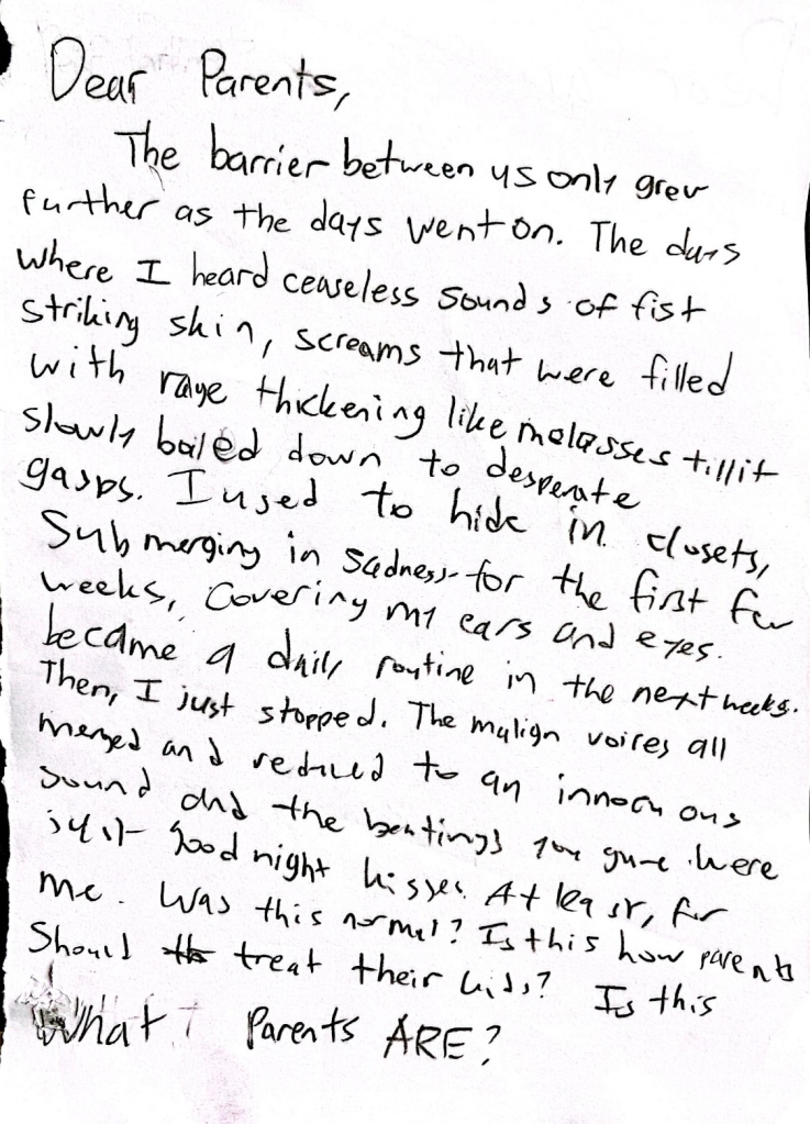
Letter made before May left:
Madeleine (May’s actress), written while we filmed her.
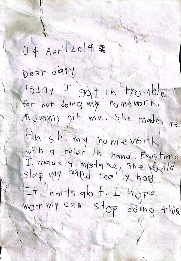

As seen above, these are the letters in chronological order, from 10 year old May to present May. As described before, the older the letters the more the creases and crumples and the sloppier the handwriting.
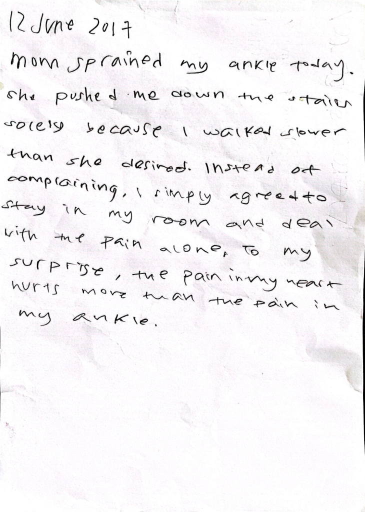
1st Letter:
– 10 year old May
– More tears
– Most uneven handwriting
– A lot of smudges all around
– Most crumples
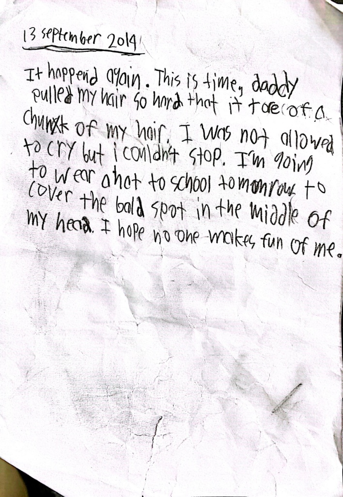
2nd Letter:
– 11 year old May
– No tears
– More even handwriting
– Smudges and pencil marks
– Less crumples
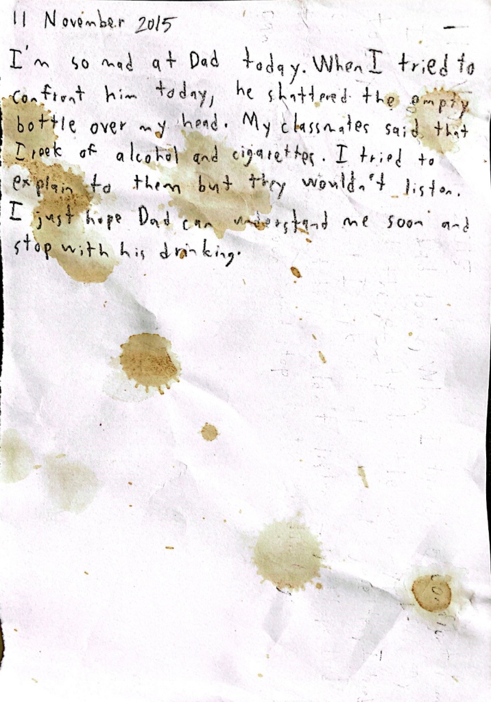
3rd Letter:
– 12 year old May
– Tea stains, signifies this letter was spilt on either on purpose or on accident. This variation also leaves the audience wandering why the letters are what they are
– More even handwriting
– Small amount of folds and creases
4th Letter:
– 13 year old May
– No tears
– More spacing in writing due to crossing out of certain words. This action can be interpreted as May being overwhelmed with emotion, so much so that she makes mistakes as she rushes her handwriting, especially since her mistakes are on words that are simple and do not describe emotion. If the crosses were on adjectives describing her emotions then that would mean that she is capable of understanding her situation enough to know better more precise adjectives that suit what she felt at that moment.
– Small amount of folds and creases
5th Letter:
– 13 year old May
– No tears
– Crossing out of only the phrase “Why??”. The added addition of question marks makes it sound like May is desperate but the replacement of the phrase into a simple “Why” can make the audience think that May does not want to seem like she’s overreacting and is trying to suppress her emotion. In this letter, we can also see that May is still in a phase where she does not realize that what her parents are doing is wrong, and instead blames herself, a common trait that victims of abuse have. This can be seen from the contents of the letters as well, where she apologizes even when she is not necessarily in the wrong in that situation.
– Little to no folds or creases
6th Letter:
– 14 year old May
– No tears
– Little to no folds or creases
– No smudges
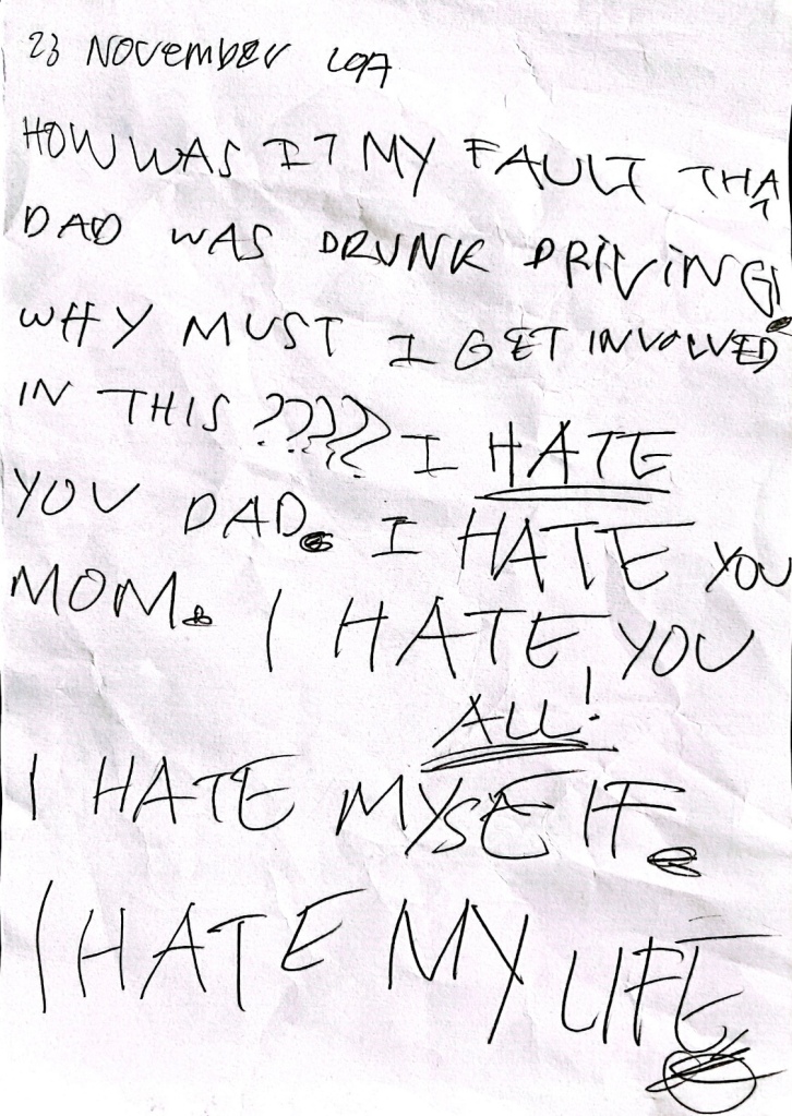
7th Letter:
– 14 year old May
– No tears
– Handwriting is messy, big, all capitalized. This is purposely done to reflect May’s overwhelming sense of frustration and want for freedom as described in its contents. This also signifies to the audience that May has finally understood that it is not her fault and is finally expressing her well deserved anger towards her parents, essentially becomes the starting point of her contemplating on leaving the house.
– More folds and creases than 3rd – 6th letter
– A bit of smudges
8th Letter:
– Present day May
– No tears
– Handwriting is neat and back to normal, shows that she has finally let go the resentment at the moment and is instead focused on leaving.
– No smudges
– No folds or creases
When making these letters, my teammates made the mistake of making the older papers look too old by painting them with tea, which makes it look too yellow. When discussing about this, I took the initiative of changing and giving criticism on what a more realistic approach on aging paper may look like and hence became what the letters shown are now.
